If R language has already become a reference in statistical analysis and data processing, it may be thanks to its hability to represent and visualize data. They can be used in order to visualize spatial data in the form of cartographic representations which, combined with its other features, makes it an excellent geographic information system. This article sets out to show, through the provision of relevant example, how R can handle spatial data by creating maps.
Prerequisite
Once R is installed on your computer, few libraries will be used: rgdal allows us to import and project shapefiles, plotrix creates color scales, and classInt assigns colors to map data. Once the libraries installed with install.packages, load them at the beginning of the session:
library('rgdal')      # Reading and projecting shapefiles
library('plotrix')    # Creating color scales
library('classInt')   # Assigning colors to data
Graphics will be plot using R base functions. ggplot2 is an alternative, but it seems less relevant here: longer and less legible code, unability to plot holes inside polygones, fortify and ploting can last much longer.
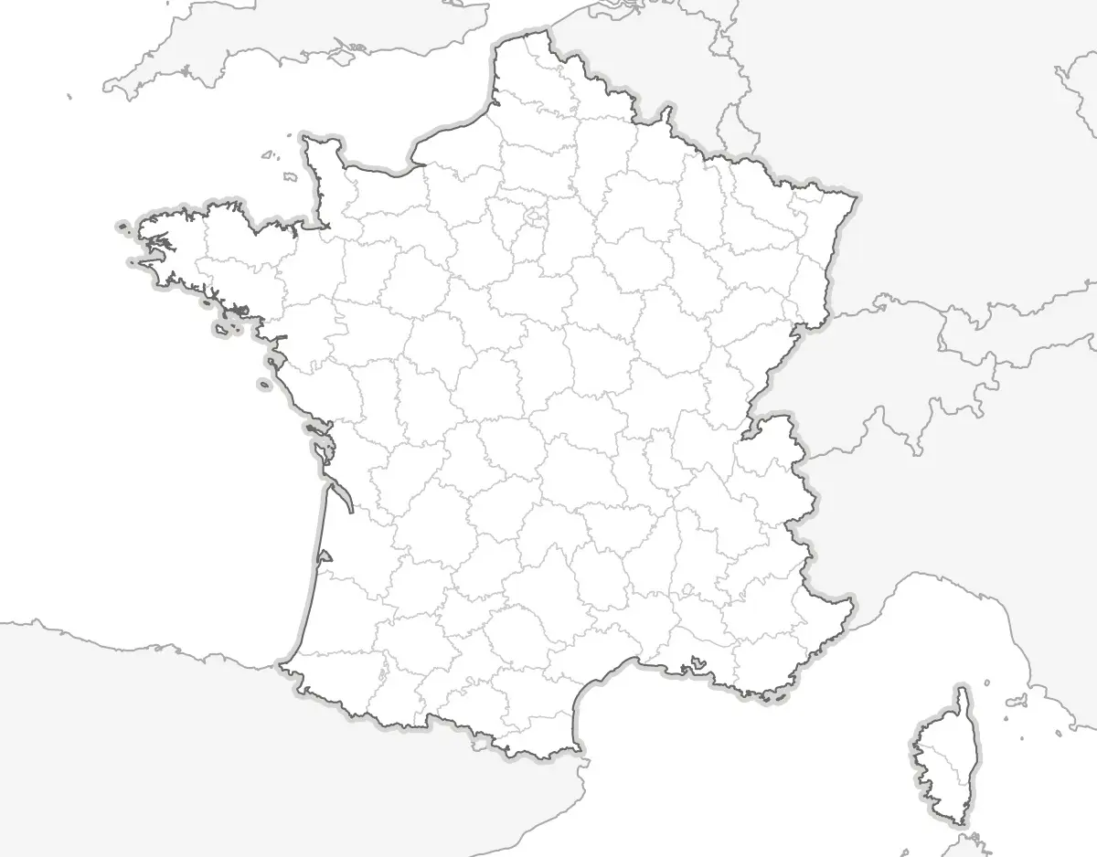
Blank France map
Reading shapefiles
The rgdal library provides readOGR() in order to read shapefiles. dsn must contain the path where shapefiles are located, and layer the shapefile name, without extension. readOGR reads .shp, .shx, .dbf and .prj files. Departements of France are given by Geofla:
# Reading departements
departements <- readOGR(dsn="shp/geofla",  layer="DEPARTEMENT")

# Reading departements boundaries in order to plot France boundaries
bounderies <- readOGR(dsn="shp/geofla",  layer="LIMITE_DEPARTEMENT")
bounderies <- bounderies[bounderies$NATURE %in% c('Fronti\xe8re internationale','Limite c\xf4ti\xe8re'),]
In order to show neighbouring countries, we will use data provided by Natural Earth. We will select Europe countries only:
# Reading country and selecting Europe
europe <- readOGR(dsn="shp/ne/cultural", layer="ne_10m_admin_0_countries")
europe <- europe[europe$REGION_UN=="Europe",]
Projection and plot
The map will use the French official projection “Lambert 93”, already declared in the Geofla .prj files. spTransform will be used for the European coutries.
Then, we will first plot French boundaries, in order to center the map on France. Borders colors are defined in border, their tickness in lwd and the filling color in col.
# Projection
europe <- spTransform(europe, CRS("+init=epsg:2154"))

# Plot
pdf('france.pdf',width=6,height=4.7)
par(mar=c(0,0,0,0))

plot(bounderies,  col="#FFFFFF")
plot(europe,      col="#E6E6E6", border="#AAAAAA",lwd=1, add=TRUE)
plot(bounderies,  col="#D8D6D4", lwd=6, add=TRUE)
plot(departements,col="#FFFFFF", border="#CCCCCC",lwd=.7, add=TRUE)
plot(bounderies,  col="#666666", lwd=1, add=TRUE)

dev.off()
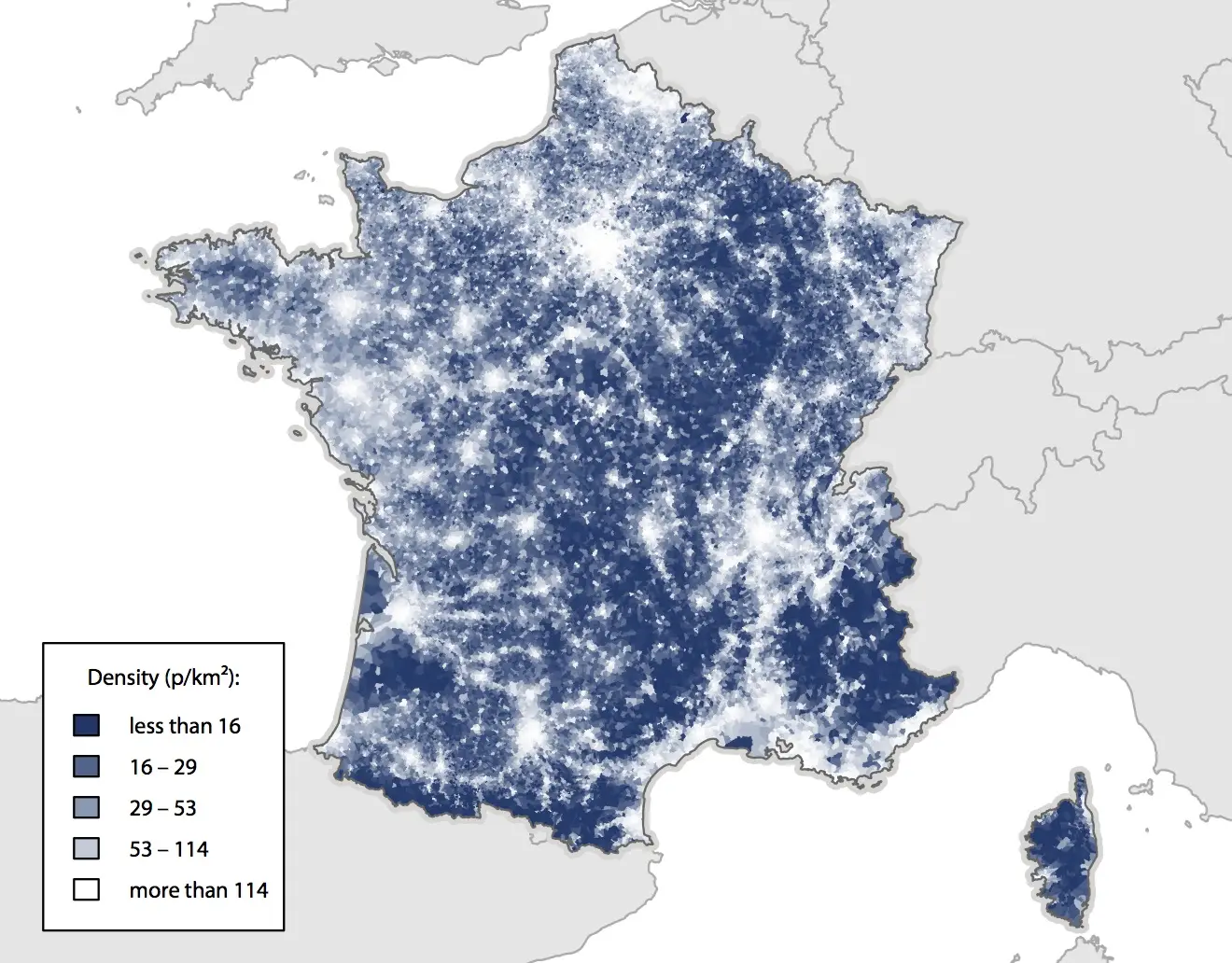
Visualizing a data: population density
Reading data
The very large number of communes (the smallest administrative level in France) gives us excellent spatial data. Geofla provides us their bounderies, population and area. So we will plot population density:
# Reading shapefile
communes <- readOGR(dsn="shp/geofla", layer="COMMUNE")
# Calculate density
communes$DENSITY <- communes$POPULATION/communes$SUPERFICIE*100000
Color scale
In order to create a color scale, we will assign shades of blue to each percentile. classIntervals calculates percentiles, smoothColors create the blue scale, and findColours assigns blues depending on each commune depending on their population density. Then, we create a legend, with only five colors.
# Color scale
col <- findColours(classIntervals(
            communes$DENSITY, 100, style="quantile"),
            smoothColors("#0C3269",98,"white"))
# Legend
leg <- findColours(classIntervals(
            round(communes$DENSITY), 5, style="quantile"),
            smoothColors("#0C3269",3,"white"),
            under="less than", over="more than", between="–",
            cutlabels=FALSE)
Plot
We can now plot the map. In order to use an embedded font in the PDF, we will use cairo_pdf() instead of pdf:
# Exporting in PDF
cairo_pdf('densite.pdf',width=6,height=4.7)
par(mar=c(0,0,0,0),family="Myriad Pro",ps=8)

# Ploting the map
plot(bounderies, col="#FFFFFF")
plot(europe,     col="#E6E6E6", border="#AAAAAA",lwd=1, add=TRUE)
plot(bounderies, col="#D8D6D4", lwd=6, add=TRUE)
plot(communes,   col=col, border=col, lwd=.1, add=TRUE)
plot(bounderies, col="#666666", lwd=1, add=TRUE)

# Ploting the legend
legend(-10000,6387500,fill=attr(leg, "palette"),
        legend=names(attr(leg,"table")),
        title = "Density (p/km²):")

dev.off()
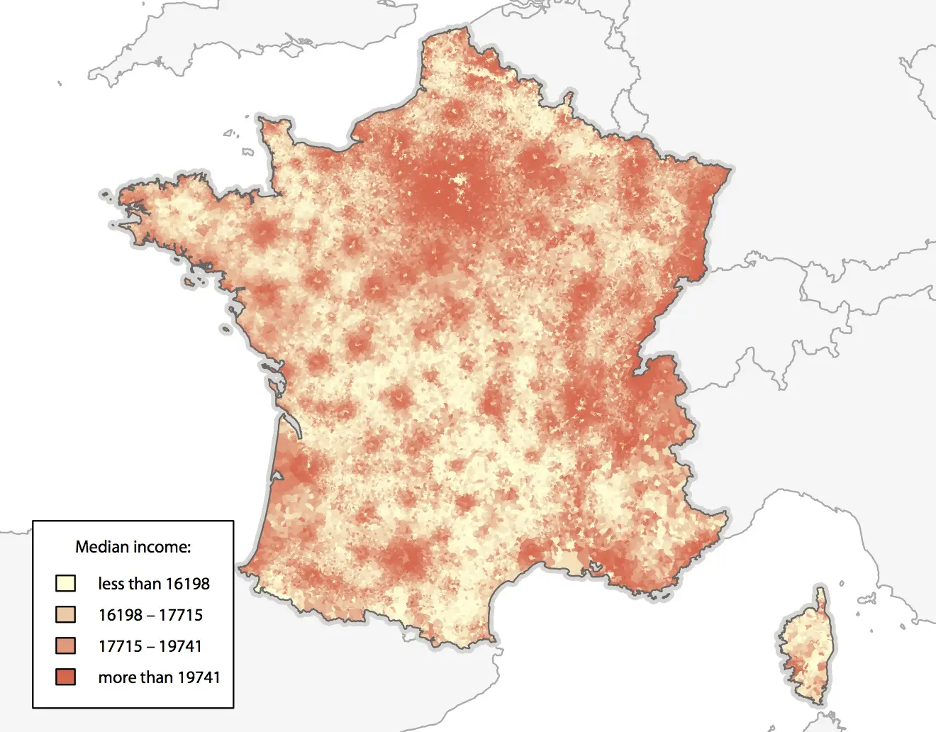
Visualizing an external data: incomes
The main value is to plot data provided by external files. We will plot the median taxable income per consumption unit.
Reading and supplementing data
Unfortunately, data is missing for more than 5 000 communes, due to tax secrecy. We can “cheat” in order to improve the global render by assigning to those communes the canton (a larger administrative level) median income, given in the same file.
# Loading communes data
incomes <- read.csv('csv/revenus.csv')
communes <- merge(communes, incomes, by.x="INSEE_COM", by.y="COMMUNE")

# Loading cantons data
cantons  <- read.csv('csv/cantons.csv')

# Merging data
communes <- merge(communes, cantons, by="CANTON", all.x=TRUE)

# Assigning canton median income to communes with missing data
communes$REVENUS[is.na(communes$REVENUS)] <- communes$REVENUC[is.na(communes$REVENUS)]
Color scale
We generate color scale and legend:
col <- findColours(classIntervals(
            communes$REVENUS, 100, style="quantile"),
            smoothColors("#FFFFD7",98,"#F3674C"))

leg <- findColours(classIntervals(
            round(communes$REVENUS,0), 4, style="quantile"),
            smoothColors("#FFFFD7",2,"#F3674C"),
            under="moins de", over="plus de", between="–",
            cutlabels=FALSE)
Plot
And we plot:
cairo_pdf('incomes.pdf',width=6,height=4.7)
par(mar=c(0,0,0,0),family="Myriad Pro",ps=8)

plot(boundaries, col="#FFFFFF")
plot(europe,     col="#F5F5F5", border="#AAAAAA",lwd=1, add=TRUE)
plot(boundaries, col="#D8D6D4", lwd=6, add=TRUE)
plot(communes,   col=col, border=col, lwd=.1, add=TRUE)
plot(boundaries, col="#666666", lwd=1, add=TRUE)

legend(-10000,6337500,fill=attr(leg, "palette"),
    legend=gsub("\\.", ",", names(attr(leg,"table"))),
    title = "Median income:")

dev.off()
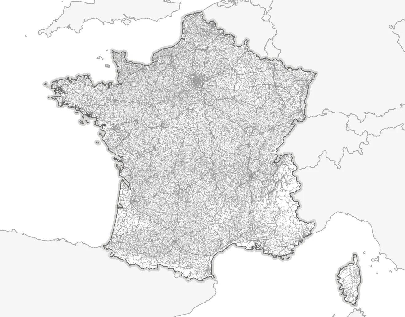
Visualizing map data: the road network
We can also add map data: cities, urban areas, rivers, forests… We will here plot the French road network, thanks to Route 500, from IGN:
roads <- readOGR(dsn="shp/geofla",  layer="TRONCON_ROUTE")
local     <- roads[roads$VOCATION=="Liaison locale",]
principal <- roads[roads$VOCATION=="Liaison principale",]
regional  <- roads[roads$VOCATION=="Liaison r\xe9gionale",]
highway <- roads[roads$VOCATION=="Type autoroutier",]

cairo_pdf('roads.pdf',width=6,height=4.7)
par(mar=c(0,0,0,0),family="Myriad Pro",ps=8)

plot(boundaries,  col="#FFFFFF")
plot(europe,      col="#F5F5F5", border="#AAAAAA",lwd=1, add=TRUE)
plot(boundaries,  col="#D8D6D4", lwd=6, add=TRUE)
plot(departements,col="#FFFFFF", border="#FFFFFF",lwd=.7, add=TRUE)
plot(local,       col="#CBCBCB", lwd=.1, add=TRUE)
plot(principal,   col="#CCCCCC", lwd=.3, add=TRUE)
plot(regional,    col="#BBBBBB", lwd=.5, add=TRUE)
plot(highway,     col="#AAAAAA", lwd=.7, add=TRUE)
plot(boundaries,  col="#666666", lwd=1, add=TRUE)

dev.off()
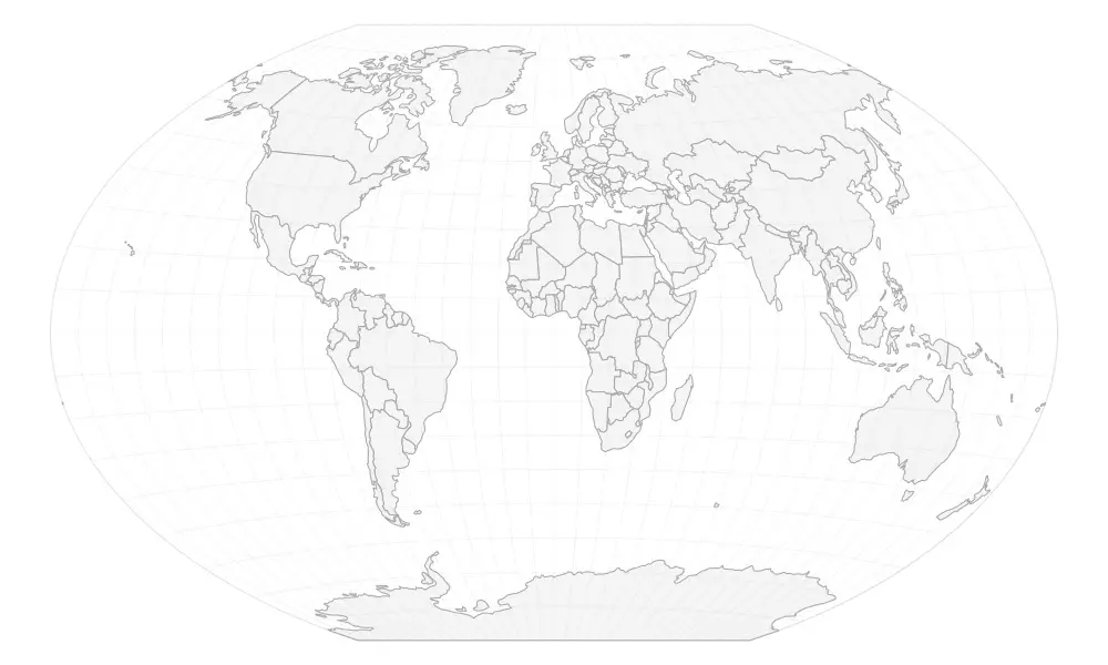
Blank world map
Reading shapefiles
We will load the following Natural Earth:
# Loading Shapefiles
countries   <- readOGR(dsn="shp/ne/cultural",layer="ne_110m_admin_0_countries")
graticules  <- readOGR(dsn="shp/ne/physical",layer="ne_110m_graticules_10")
bbox        <- readOGR(dsn="shp/ne/physical",layer="ne_110m_wgs84_bounding_box")
Projection and plot
We will use the Winkel Tripel projection:
# Winkel Tripel projection
countries   <- spTransform(countries,CRS("+proj=wintri"))
bbox        <- spTransform(bbox,  CRS("+proj=wintri"))
graticules  <- spTransform(graticules, CRS("+proj=wintri"))

# Ploting world map
pdf('world.pdf',width=10,height=6) # PDF export
par(mar=c(0,0,0,0))                # Zero margins

plot(bbox, col="white", border="grey90",lwd=1)
plot(countries, col="#E6E6E6", border="#AAAAAA",lwd=1, add=TRUE)
plot(graticules, col="#CCCCCC33", lwd=1, add=TRUE)

dev.off()                          # Saving file
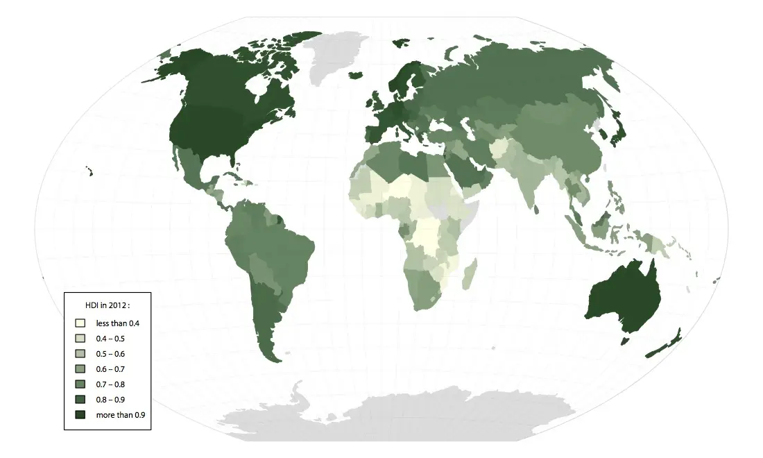
Visualizing data: Human Development Index
Most frequent usage consists of visualizing data with a color scale. Let’s plot the HDI, provided by the United Nations Develment Programme in a CSV file. The procedure is as described above:
# Loading data and merging dataframes
hdi  <- read.csv('csv/hdi.csv')
countries <- merge(countries, hdi, by.x="iso_a3", by.y="Abbreviation")

# Converting HDI in numeric
countries$hdi <- as.numeric(levels(countries$X2012.HDI.Value))[countries$X2012.HDI.Value]

# Generating color scale and assigning colors
col <- findColours(classIntervals(countries$hdi, 100, style="pretty"),
                       smoothColors("#ffffe5",98,"#00441b"))

# Assigning grey to missing data
col[is.na(countries$hdi)] <- "#DDDDDD"

# Generating legend
leg <- findColours(classIntervals(round(countries$hdi,3), 7, style="pretty"),
                       smoothColors("#ffffe5",5,"#00441b"),
                       under="less than", over="more than", between="–", cutlabels=FALSE)

# Ploting
cairo_pdf('hdi.pdf',width=10,height=6)
par(mar=c(0,0,0,0),family="Myriad Pro",ps=8)

plot(bbox, col="white", border="grey90",lwd=1)
plot(countries,  col=col, border=col,lwd=.8, add=TRUE)
plot(graticules,col="#00000009",lwd=1, add=TRUE)

legend(-15000000,-3000000,fill=attr(leg, "palette"),
    legend= names(attr(leg,"table")),
    title = "HDI in 2012:")
dev.off()
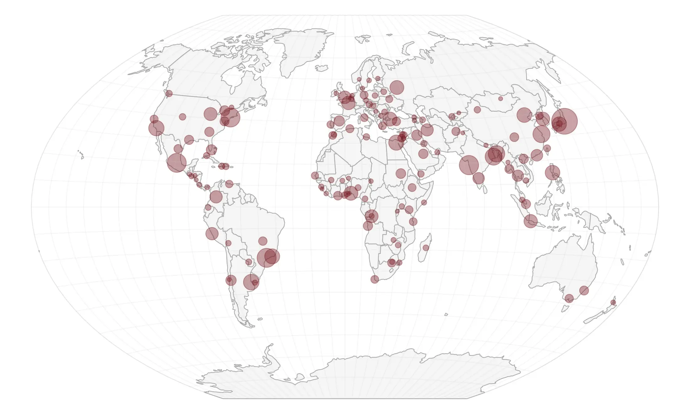
Circles visualization: most populated cities
Reading data
An other kind of visualization is given by circles. Population of most populated cities is provided by Natural Earth:
# Loading shapefile
cities <- readOGR(dsn="shp/ne/cultural", layer="ne_110m_populated_places")
cities <- spTransform(cities, CRS("+proj=wintri"))
Circle size
The data shall be proportionate to the circles areas, not the radius; so the radius is the square root of the population:
# Calculating circles radius
cities$radius <- sqrt(cities$POP2015)
cities$radius <- cities$radius/max(cities$radius)*3
Plot
We plot the map:
pdf('cities.pdf',width=10,height=6)
par(mar=c(0,0,0,0))

plot(bbox, col="white", border="grey90", lwd=1)
plot(countries, col="#E6E6E6", border="#AAAAAA", lwd=1, add=TRUE)
points(cities, col="#8D111766", bg="#8D111766", lwd=1, pch=21, cex=cities$radius)
plot(graticules, col="#CCCCCC33", lwd=1, add=TRUE)

dev.off()
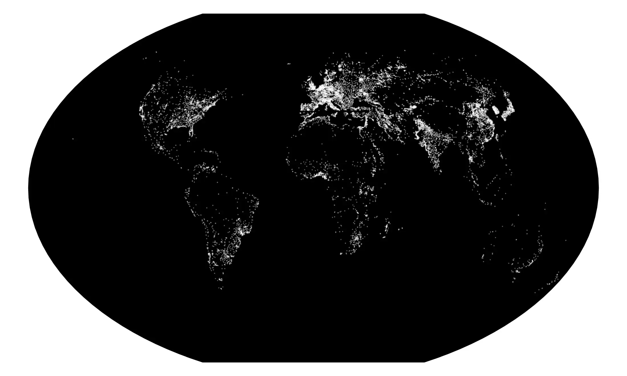
Visualizing map data: urban areas
Natural Earth provides urban areas shapefiles, derived from satellite data. Let’us map them with night lights colors:
areas  <- readOGR(dsn="shp/ne/cultural",layer="ne_10m_urban_areas")
areas <- spTransform(areas, CRS("+proj=wintri"))

pdf('areas.pdf',width=10,height=6)
par(mar=c(0,0,0,0))
plot(bbox, col="#000000", border="#000000",lwd=1)
plot(countries, col="#000000", border="#000000",lwd=1, add=TRUE)
plot(areas, col="#FFFFFF", border="#FFFFFF66",lwd=1.5, add=TRUE)

dev.off()